

Begin with the end in mind—defining our goals
Our collaboration with South Dakota State University’s (SDSU) outreach arm, SDSU Extension, began by defining the user experience and branding issues that the previous site had. The visual design was in need of an update, the team wanted to make information easier for people to find, and mobile users were forced to view the desktop version of the site.
With these issues defined, we put together a series of goals that fell into two major groups—user experience and branding. For the user experience goals, we defined a user-centered approach to ensure that the work we were doing was going to help people using the site engage more with the site and more easily find what they were looking for. For the branding goals, we wanted an improved, modern look and feel that felt like a part of the larger South Dakota State University brand.
Creating a palette to work from (e.g. creating Style Tiles)
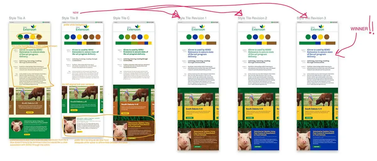
Every design project at Four Kitchens starts with a visual alignment in the form of style tiles, a design deliverable showing colors, fonts, and elements that helps create a common visual language for the project.
These are presented to everyone using InVision Freehand so that as we discuss the options we can add notes directly on the style tiles. For SDSU Extension we had two rounds of style tiles, landing quickly on one that we all agreed was the right direction.
Figuring out what we’ll need (e.g. wire-framing all the things)
Design systems are all the rage in the industry and with good reason. They allow projects to move more quickly by having a library of reusable parts that are ready to go. So at this point in the process for SDSU Extension, it was time to define what those parts needed to be.
We did this by reviewing the current site and discovery document to suss out what was going to be important for the new site. As a group—Four Kitchens and SDSU Extension—had discussions to detail what sorts of things would be vital and what would be nice-to-haves.
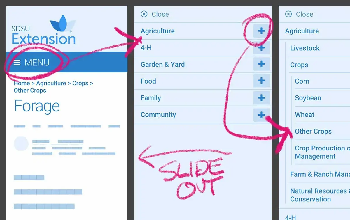
From there we worked up a series of wireframes that showed both a component library—a page with every possible thing on it, like cards, quotes, and video callouts—and a few samples of how the new pages could be assembled from these parts.
This process worked out the kinks for trickier components, like the many-level deep navigation on mobile while minimizing effort. The cycle of posting, review, and implementing feedback was quick leading us to a final collection of wireframes.
Making it come to life (e.g. comps)
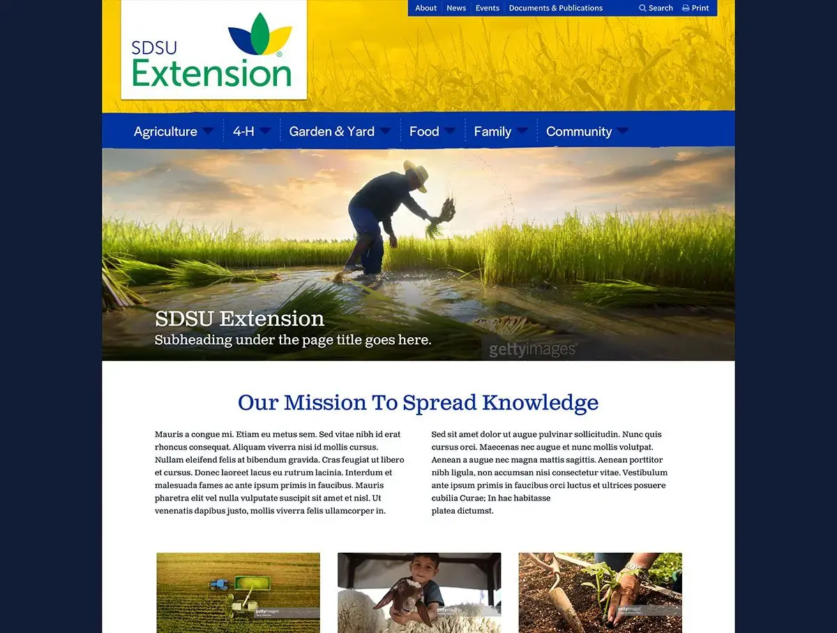
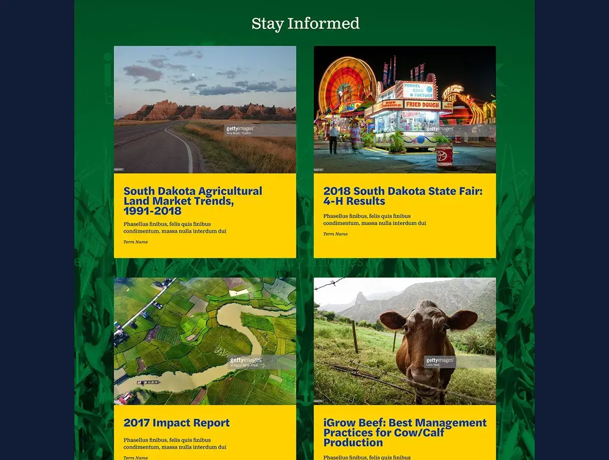
As soon as wireframes were approved we moved into the next step—breathing life into them. We took the visual language that was defined in the style tile and applied it to the wireframes. The designs included all of the components at small, medium, and large screen sizes.
These components were then quickly assembled into mock pages to show what they would look like when the site was done. Having a wealth of work already done in the form of style tiles and wireframes, we hit on the right direction quickly. Once the first few comps were finalized there was a flood of comps as we built them out faster and faster using previously approved components.
A great collaboration
Working with SDSU Extension on this project was marvelous and we’re happy that it is live and shared with the rest of the world.
Making the web a better place to teach, learn, and advocate starts here...
When you subscribe to our newsletter!