
The popularity of responsive web design is constantly exposing behaviors that web browsers have gotten away with over the years. Many of these behaviors — while brilliant for a single-screen web — become a direct hindrance when dealing with the multi-screen extravaganza that we face now.
One of the most hotly debated topics is responsive images. This was a topic widely exposed by Filament Group due to their work on the Boston Globe, and it continues to be an issue for every bandwidth-conscious site today.
Update 2013-10-28: The possibility we mentioned this post has come true. The <picture> technique outlined in this blog post has been replaced by several competing ideas (and might be published as a Note rather than a Recommendation). The most notable alternative is src-N which is even more appealing when combined with a new HTTP header being proposed, called Client Hints. We encourage you to do diligent research before implementing responsive images long-term on a project, and make sure you’ll have the ability to support the option you choose for the lifetime of the project.
Update 2014-03-18: Life on the bleeding edge, eh? Picture is back on the table, with multiple vendors moving to implement. Stay updated by visiting http://responsiveimages.org
Update 2014-08-14: <picture> is now shipping in Chrome and Firefox nightlies and will ship very soon! Huzzah! Stay updated by checking caniuse.com. In other news, Picturefill 2.1 has been released which improves spec conformity. Lastly, I have written an article demonstrating how to automatically test your Picturefilled <picture> elements with CasperJS.
History
The foundations of this topic have been hotly debated and oft explored in the past year, so here’s a list of articles that capture the history of responsive images and demonstrate the challenges developers face on a modern site:
- Mat Marquis, part of Filament Group and the Boston Globe team, took it upon himself to take the helm of this issue, writing about the initial challenges and creating the Responsive Images Community Group. The group has proposed a solution and is busy solidifying a web standard for responsive images, backed by the trial and error of developers worldwide.
- Jason Grigsby has written extensively about responsive image techniques, deftly balancing the need for simplicity on the authors’ side, while recognizing the underlying tech issues browsers inadvertently (and rightfully) created during our beloved single-screen golden era.
- Robert Paul Lloyd writes about how no solution is ideal, suggesting that we go back to the drawing board and create an entirely new image format. In the long term this is pretty likely. For certain types of imagery a bandwidth-cheap, scalable format already exists in SVG, icon fonts, and other vector formats. A similar vessel needs to exist for photos too.
Today’s solution
Whatever the final outcome of the standards process, if you find yourself needing responsive images today there are several approaches, the most successful of which is currently the <picture> element.
In a nutshell, <picture> is a brand new element with behavior that is — for now — controlled by JavaScript. This allows us to achieve all of the goals for a proper responsive image request: avoiding image prefetching, preferring author-controlled image selection, and ultimately only downloading a single image (instead of a fallback plus larger version)
Picturefill is its own open-source library, available on Github.
Implementing responsive images on a Drupal site
The latest responsive site that Four Kitchens launched, Full Plate Living, tightly integrates responsive images with Drupal content. The methods for doing so are thankfully rather easy, but as with all things Drupal there is a bit of a learning curve to get started. Responsive images can be added to content, views, etc. with the help of two contributed modules: Breakpoints and Picture. These two modules rely on Drupal’s core Image Styles module to output images in various sizes using a URL-specific, render-on-demand system.
Configuring breakpoints
In responsive web design breakpoints are used with media queries to determine when new CSS rules should apply to the site’s markup. As its name suggests, the Breakpoints module allows your site to define media queries on which you’d like to take action. The module provides a canonical list of breakpoints that are accessible from the database and thus surfaced to your site’s code. The Breakpoints module also has the notion of a “breakpoints group.” Groups are particularly useful for defining sets of breakpoints that are only relevant to certain parts of the site. These breakpoints can then be semantically referenced by their group name which allows you to reuse breakpoint names between groups, even if the media queries aren’t the same.
In the case of Full Plate Living we had one global set of breakpoints that was defined in the theme’s .info file:
breakpoints[smartphone] = (min-width: 320px)
breakpoints[fourhundred] = (min-width: 415px)
breakpoints[smartphone_only] = (min-width: 320px) and (max-width: 767px)
breakpoints[smartphone_landscape] = (min-width: 480px)
breakpoints[smartphone_landscape_only] = (min-width: 480px) and (max-width: 767px)
breakpoints[small_menu] = (min-width: 430px)
breakpoints[smaller_menu] = (min-width: 421px)
breakpoints[recipes_landing] = (min-wdith: 520px)
breakpoints[user_reg] = (min-width: 625px)
breakpoints[tablet] = (min-width: 768px)
breakpoints[tablet_only] = (min-width: 768px) and (max-width: 979px)
breakpoints[desktop] = (min-width: 980px)
This same set of breakpoints was used in our Sass and JavaScript files (with response.js) to provide a consistent list of breakpoints for all of our front end code to interact with. Unfortunately this list was duplicated in the three places; a future implementation might use a build tool like grunt to keep the global breakpoints list in one place and update the .info, Sass, and JavaScript definitions appropriately.
Additional breakpoint groups were added for content types so that the amount of markup required for responsive images could be kept down (one breakpoint means two picture options: the default, and the one defined for the breakpoint).
Configuring image styles
Core’s Image Styles are used to format the images that will be used in the picture element. It’s a good idea to give the image styles meaningful names so that configuring the Picture module is more straightforward. In the case of Full Plate Living we generally used two image styles per page: STYLE__full for images delivered to large viewports, and STYLE__mobile for images delivered to small viewports.
Configuring Picture
The Picture module ties information from Breakpoints and Image Styles together and ultimately provides the markup and picturefill JavaScript that will be used on the page. Each breakpoint group will have a tab on the Picture admin page that lists its breakpoints and provides a dropdown for each one to specify the image style that should be used.

Finally, when you’re defining the display style for your image fields you will choose “Picture” as the formatter for the image. The settings for this field will allow you to choose the “picture group” and a “fallback” image style. The fallback image style will be used if no breakpoint conditions are met. If you’re building mobile-first, this would be your base mobile style definition and should be the smallest image that will be delivered to the client.

Show me the data
To demonstrate the advantages of the <picture> element we captured data from the Full Plate Living recipe landing page. See those beautiful, gigantic images below the search? Such a huge image is not needed for the same effect on a small screen. Implementing <picture> resulted in a difference of 157K out of a max page weight of 746K. Here are the two network waterfalls:
Mobile
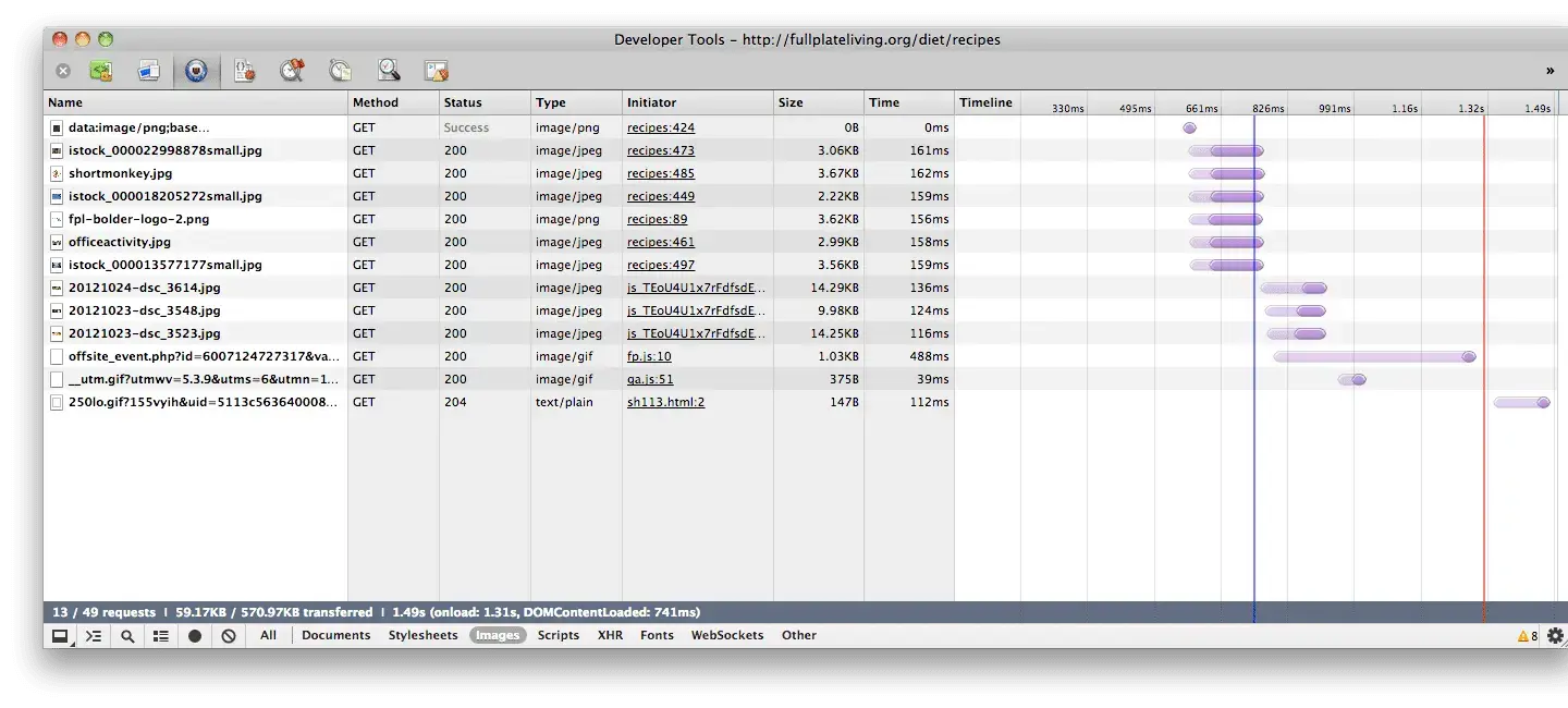
The three images in this screenshot that start with 2012 are the mobile-formatted images. They total approximately 40K at the default breakpoint.
Desktop
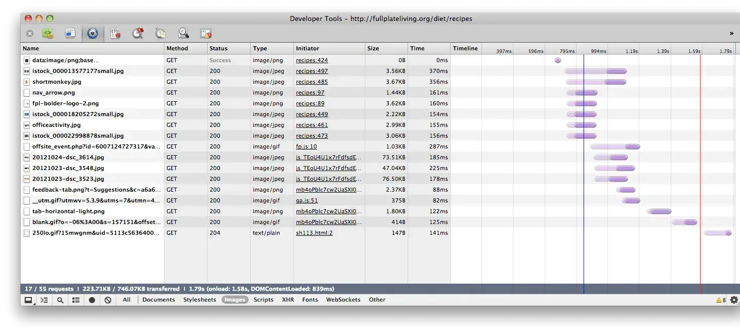
Looking again at those images with the same 2012 prefix, we see a total of 197K, meaning we are preventing the site from serving mobile users with approximately 157K of data that they don’t need.
You can see that the download “initiator” for the images is a script — not the HTML page — due to the picturefill script modifying the DOM and specifying the image that should be used. This DOM modification causes the markup on the page to differ based on the viewport, visible in this gist.
Div + data-attributes
The <picture> element was used on Full Plate Living, but for now it’s considered slightly more future-proof to use as of August 2014 you should feel confident that using <div> elements with data attributes.<picture> with Picturefill 2.1 is a solid, future-proof implementation.
<div data-picture data-alt="A giant stone face at The Bayon temple in Angkor Thom, Cambodia">
    <div data-src="small.jpg"></div>
    <div data-src="medium.jpg"     data-media="(min-width: 400px)"></div>
    <div data-src="large.jpg"      data-media="(min-width: 800px)"></div>
    <div data-src="extralarge.jpg" data-media="(min-width: 1000px)"></div>

    <!-- Fallback content for non-JS browsers. Same img src as the initial, unqualified source element. -->
    <noscript>
        <img src="external/imgs/small.jpg" alt="A giant stone face at The Bayon temple in Angkor Thom, Cambodia">
    </noscript>
</div>
The picturefill script and Picture module both currently use the <div> method, so although your markup will look different, the end result will be the same.
In conclusion
We all recognize the need for a responsive image container on the web. Today’s solution might look very different from tomorrow’s, but the need for device-optimized media will continue to grow as fast as the variety of devices accessing the web. Just hang on, remember to test, and enjoy the ride!
Credits: this article was co-written by Elliott Foster.
Making the web a better place to teach, learn, and advocate starts here...
When you subscribe to our newsletter!