
Recap and remix
In my last post I discussed the challenges inherent in modeling fields when you are unable to achieve a complete understanding of a data set. Much of that post was based on a flexible field model for content that was semantically tabular. To bring you up to speed but also show some of the content editing experience, let us take a look again at our model, but this time in Drupal.
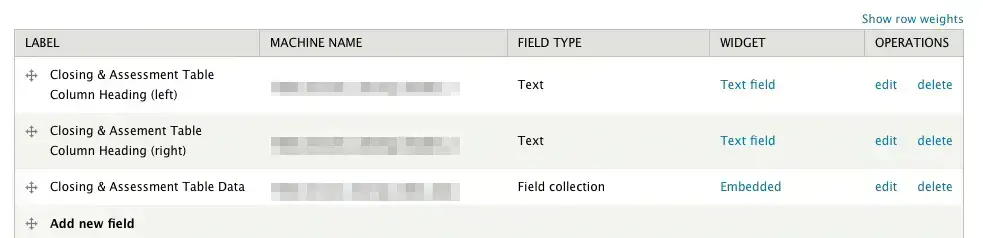
We have a nested field collection situation which can be described as:
Field Group {
Field Collection for Table (1 or more / set to 1 initially) {
Header 1 - text field (provided with default heading values)
Header 2 - text field (provided with default heading values)
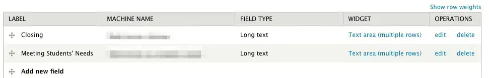
Field Collection for Table Data (1 or more / set to 1 initially) {
Row data 1 - text long (w/ WYSIWYG editing)
Row data 2 - text long (w/ WYSIWYG editing)
}
}
}
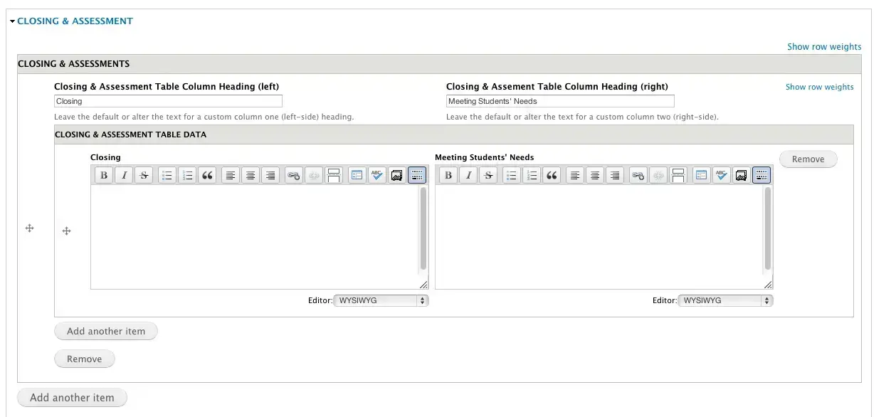
The containing table field collection looks something like this:
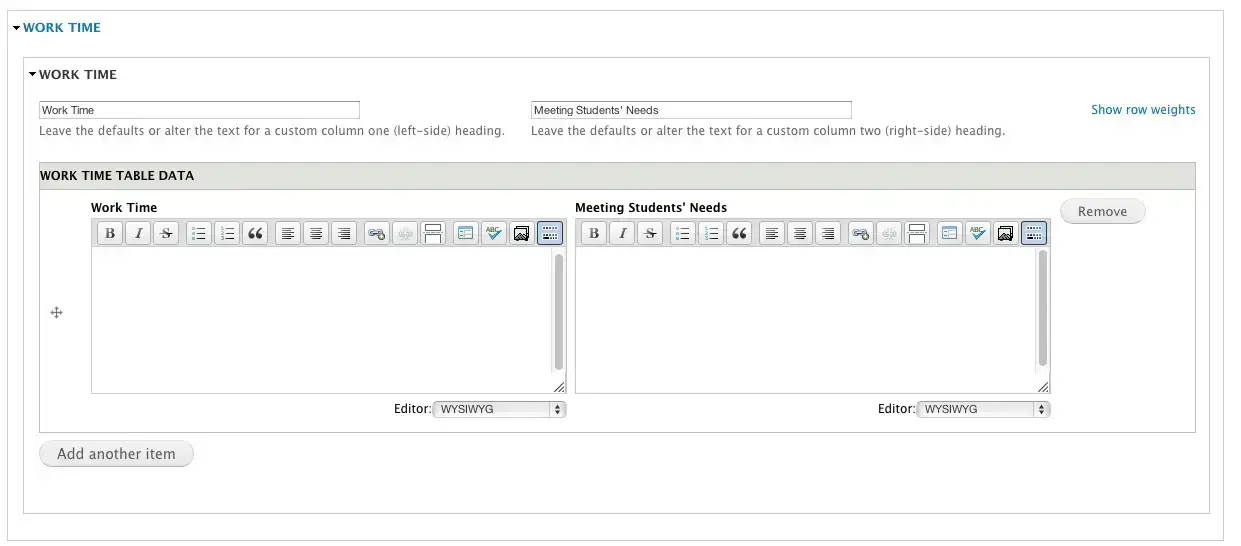
Our nested row data field collection in the containing table field collection looks something like this:
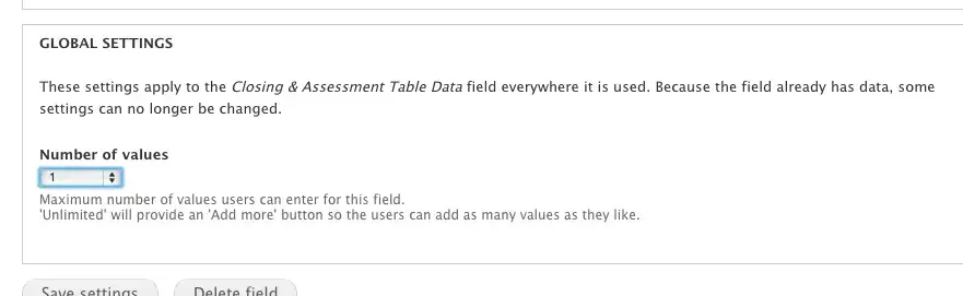
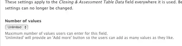
Initially the number of values the site will allow for either of the field collections was configured as 1. This setting (Number of values) is available in the Global settings for your field collection in its field settings screen – available as the edit link from your field collection listing on /admin/structure/field-collections.
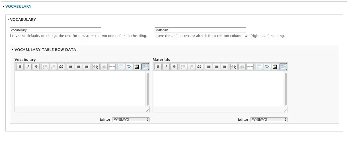
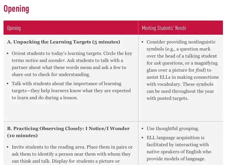
Thanks to a table field formatter, discussed at length a little later in this post, some CSS and a few tweaks made to widgets and field settings the content contributor experience for our field model is pretty streamlined at that point. It looks something like this:
We can increase that box to any number of values by setting the “Number of values” setting to unlimited.
If we do that for the rows field collection that will allow content contributors to add multiple rows to the table:
If we make the number of values unlimited for both the top containing field collection and the nested row data field collection, content contributors can add multiple rows and multiple tables.
So yeah, tables. After so much misuse in the early 2000s and the resultant disdain, I really enjoy the semantically appropriate return of our erstwhile markup pal, the table. Rejoice, the table has returned!
Presenting the table! <…cricket chirps… >
Well, as it turns out, that in the present age of responsive design, the table still has issues. The limited real estate of our handhelds and even tablet computers can pose a real challenge to the often wide space requirements of tabular data. There are plenty of shortcuts to presenting data like this responsively, throw the content in some containers like divs, plug some percentage widths in there, add some media queries, and hey, it looks like a table, yay, we are done, right?
While responsive, that’s not very responsible and hardly semantic. Would you doom the table to misrepresentation knowing fully its storied but grim past? What about assistive technologies like screen readers? Visitors without the benefit of vision don’t know that your content looks like a table. They only know what it sounds like. A bunch of divs doesn’t sound like a table. What about automatic content consumption technologies of today and the future, crawlers, scrapers, and other utilities. They only know your content as its markup indicates and content in containers like divs isn’t content in table rows and columns. Making incorrect semantic choices is not only poor form, it is exclusionary. We didn’t build the web for that, did we? No, no we didn’t.
Responsible responsivity
Luckily many people have been hard at work on solutions to this issue. There is a really great recap with working code of responsive table approaches from Simon Elvery at http://elvery.net/demo/responsive-tables/. Each of these solutions responds to the small screen real estate problem in a different way. The results have different feels and so one size is not going to fit all. In “The Unseen Column” approach by Stuart Curry, as the screen size shrinks, columns are omitted from display. So, while not all columns are represented, the main gist of the information is communicated. In the “Flip Scroll” approach by David Bushell, rows are columns are switched, it allows for a complete understanding of one row, and depending on your screen orientation, possible comparison.
This brings us back to our field model from last week. After examining these different responsive table approaches it was time to decide the best fit for our content and to figure out our approach for translating that data model into an responsive table on the presentation layer. The solution we chose was the “no-more-tables” solution, or rather, a slightly modified version of the “no-more-tables” solution. Before you call ‘shennanigans’, don’t worry, “no-more-tables” is in quotes for a reason, they actually ARE tables.
The “no-more-tables” approach as described and developed by Chris Coyier (http://css-tricks.com/responsive-data-tables) uses CSS media queries to detect screen size, and when the table loses visible viability it basically overrides the typical table display by forcing table cells to display as block items. {example} Additionally, column headers, which might get lost as the content grows vertically, are brought to the content they reference through a CSS content “:before” approach. This approach was further refined by Simon Elvery in his demo example using the super flexible HTML 5 custom data attributes. These attributes are intended for specific custom data that are private to the page or application. The attributes allow us to take the content out of CSS and keep it in the markup, thats easily doable with a CMS like Drupal and as an approach feels correct. Basically, we are taking the column headings and putting them into these attributes for each of the cells. This allows the markup to stay as a table but have a presentation that really honors mobile form factors.
For our specific content, the content filling out that flexible field model I discussed in my last post, it was well suited for no-more-tables because it had a small number of columns. This meant that the transition from having that information displayed horizontally for comparisons to displayed vertically for comparisons actually provided a similar experience. The purpose of this particular content was to allow comparisons, users would need to compare columns in the same row and then understand the next row as another grouped but separate concern in the same format. Some of the other responsive table approaches would have been overkill and so the “no-more-tables” approach was the goldilocks approach, not too much or too little change when going from screen to screen.
Responsive table field formatters
The flexible field model we settled on was a series of nested field collections. One way to get our field collection into the “no more tables” approach could have been through a template (tpl.php) solution. However, I like the flexibility and empowerment of field formatters. Being able to switch presentation approaches on a field by field level at the click of a mouse is very powerful indeed. This ability is very useful for demos, prototypes, and letting site builders make and experience different options. Given the high degree of flexibility we already knew we needed from our content — leaving things open seemed like the right choice.
Field formatters aren’t terribly difficult to put together, they can be as easy as filling out hook_field_formatter_info to tell Drupal about your formatter and hook_field_formatter_view to spit out your field correctly. However, field collection field formatters aren’t terribly fun. There is a lot going on here, especially with the nested sets.
Luckily and thankfully there already is a table field formatter for field collections called Field Collection Table, seriously, way to go Tim Plunkett! This saved me hours and hours. Let’s take a look at the few changes that were needed to shape the existing solution to our responsive table needs.
The main changes come in hook_field_formatter_view where we deal with the variable headings for the tables, add in the data attribute to the table cells and deal with extracting row and table information from the nested field collections. Additional changes are made in hook_form_alter to accommodate nested field collections made possible by this patch from rooby on drupal.org https://drupal.org/node/1438266. Finally there was a small bit of work to eliminate the sticky headers in hook_theme and theme.inc.
Ok, the most important bit is getting the data attributes into the cells. This is actually pretty easy to do – the cell data is being assembled via a render array, td attributes can be added to the existing render array at ln 69:
$content[$field_name],
‘class’ => $field_name,
);
?>
like this:
$content[$field_name],
‘class’ => $field_name,
‘data-title’ => $your_header_variable,
);
?>
So, this leaves you to populate the variable, $your_header_variable. To do so you’ll need to pull that out of the data from the field collections. Because we had a pretty complicated data structure with nested field collections that could have multiple tables and multiple rows it got fairly complicated quickly, if you don’t need that level of complication you can still extract what you need for a responsive table solution. In ln 51 there is an foreach loop to go through each field collection – what maps to a row in our table. For each of the items we get the field collection entity through the field_collection provided function: field_collection_field_get_entity. Probably the best place is in line 59 in yet another foreach loop, which relates to the columns in your table, grab the field name or english version of your field name as the attribute.
For our data structure we needed to create two sets of for each loops to deal with the nested field collections and the variable table row headings. Essentially setting up some arrays to store header information for each table instance in the field collection and then another array structure to hold the rows within that structure, and again, so much gratitude to Tim Plunkett, whose code this is built upon:
$item) {
$header = array();
$rows = array();
$row_items = array();
$field_collection = field_collection_field_get_entity($item);
// Get the headers for this table
$variable_column_names = array();
$lang = language_default();
$count = count($header_field_names);
$column_header = array();
for ($i=0; $i < $count ; $i++) { $field_name = $header_field_names[$i]; if (!empty($field_collection->$field_name)) {
$value = current(reset($field_collection->$field_name));
$value = $value[‘value’];
}
else {
$value = ”;
}
// Our table headings for this table.
$header[$i] = array(
‘data’ => $value,
‘class’ => $field_name,
);
$column_header[$i] = $value;
}
$data_rows = $field_collection->$data_field;
if (isset($data_rows[$lang])) {
if (count($data_rows[$lang])) {
$row_items = reset($data_rows);
}
}
else {
return;
}
// Ok, now another foreach loop for the actual rows.
foreach ($row_items as $delta => $item) {
// Get field collection entity for each row of data.
$field_collection = field_collection_field_get_entity($item);
if (empty($field_collection)) {
continue;
}
$view = $field_collection->view();
$content = $view[‘field_collection_item’][$field_collection->identifier()];
$column = array();
// This will tell us how many columns we need to iterate through.
$count = count($table_field_names);
for ($i=0; $i < $count; $i++) { $field_name = $table_field_names[$i]; $data_title = $column_header[$i]; if (isset($content[$field_name])) { $content[$field_name][‘#label_display’] = ‘hidden’; } else { $content[$field_name] = array( ‘#markup’ => ”,
‘#empty’ => TRUE,
);
}
// We’ll add our columns to a data array for each row.
$column[] = array(
‘data’ => $content[$field_name],
‘class’ => $field_name,
‘data-title’ => $data_title,
);
}
// Now add that column data to the render array for rows
$rows[] = array(
‘data’ => $column,
‘class’ => array(‘field_collection_item’),
);
}
if (count($rows) == 0) {
return;
}
// Finally we will add all or our rows and headers to render array.
$element[] = array(
‘#theme’ => ‘table’,
‘#header’ => $header,
‘#rows’ => $rows,
‘#sticky’ => FALSE,
);
if (!empty($settings[’empty’])) {
$element[0][‘#theme’] = ‘table__field_collection_responsive_table’;
$element[0][‘#settings’][’empty’] = TRUE;
}
}
break;
}
field_collection_field_formatter_links($element, $entity_type, $entity, $field, $instance, $langcode, $items, $display);
return $element;
}
?>
As a final improvement to help us get even closer to simpler markup for these responsive tables we employed the Fences module to assist us in removing markup cruft. Fences (https://drupal.org/project/fences) is a great module that simplifies default Drupal div based layouts.
The finished product on desktop:
The finished product shrunk for mobile devices with the “no more tables” approach:
Your local mileage may vary depending on how you’ve implemented the field collection. I have this work available as a Drupal sandbox if you’d like to take a deeper look or even modify the code for your own.
Making the web a better place to teach, learn, and advocate starts here...
When you subscribe to our newsletter!