
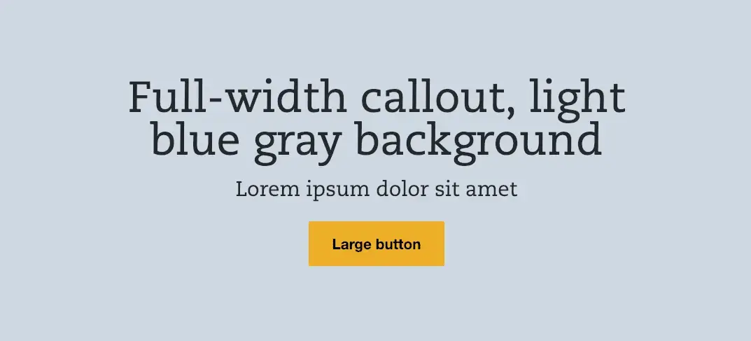
In part 1, we set up our style guide and put some basic styling in place. In this article, we’ll work on building a simple component: the Callout. Let’s take a look at the design:
Using the language of Atomic Design, this can be defined as a “molecule,” because it is a collection of a few atoms (two heading elements and a link). In terms of creating those atoms, we can simply use the heading code covered in the Typography section in the first article for the two heading elements. That only leaves us needing to define a button element.
Buttons
Let’s open up components/01-atoms/buttons/_buttons.scss. Here, we will style the buttons (and any variations). Here’s the scss mixin code for the button we see above:
@mixin button($bg: $yellow, $color: $black, $hoverBg: transparent, $hoverColor: $yellow, $borderColor: $yellow) {
  background-color: $bg;
  border: 2px solid $borderColor;
  color: $color;
  cursor: pointer;
  font-weight: bold;
  line-height: 1.4;
  padding: 0.5em 1em;
  display: inline-block;
  text-decoration: none;
  text-align: center;

  &:visited {
    color: $color;
  }

  &:hover {
    background-color: $hoverBg;
    color: $hoverColor;
  }
}
Save this file and you will see your new button styles reflected in the Button atom in Storybook. Because these styles are in Sass mixins, we can reuse them across components easily — even for links! And now that we have our button styles, let’s create our Callout component.
Callout
Here’s our new Callout component directory structure (inside components/02-molecules):
<!-- wp:paragraph -->
<p>callout</p>
<!-- /wp:paragraph -->

<!-- wp:list -->
<ul><li>_callout.scss</li><li>callout.twig</li><li>callout.yml</li><li>callout.stories.js</li></ul>
<!-- /wp:list -->
Let’s start with our markup. In callout.twig we’ll want the following:
{% set callout_base_class = 'callout' %}

<div {{ bem(callout_base_class, callout_modifiers, callout_blockname) }}>
  <div {{ bem('inner', [], callout_base_class) }}>
    {% include "@atoms/text/headings/_heading.twig" with {
      heading_level: 2,
      heading: callout_title,
      heading_base_class: 'title',
      heading_blockname: callout_base_class,
    } %}
    {% include "@atoms/text/headings/_heading.twig" with {
      heading_level: 3,
      heading: callout_subtitle,
      heading_base_class: 'subtitle',
      heading_blockname: callout_base_class,
    } %}
    {% if callout_button_url %}
      {% include "@atoms/links/link/link.twig" with {
        link_content: callout_button_text,
        link_url: callout_button_url,
        link_blockname: callout_base_class,
        link_base_class: 'button',
      } %}
    {% endif %}
  </div>
</div>
Let’s break down this code to understand the different parts.
Variables and outer elements
At the beginning, we’re setting our Callout base class to a Twig variable since we want to reuse it frequently. In our first outer div element, you’ll notice we’re using the BEM function to set our classes. If you’re new to Emulsify, you’ll want to get familiar with this function as it will become your new best friend (usage instructions here). This is a custom Twig function we wrote to make it faster and easier to pass in BEM classes as we build components (especially as you integrate them later).
For our purposes, just know this line will create <div class=”callout”>, but we’ll be expanding on its possibilities soon. The next element is similar and will create <div class=”callout__inner”> (callout being the block and inner being the element). Since the callout background fills the screen, and we need the content area to stay centered within a max-width, this .callout__inner element helps us accomplish that.
Inner elements (atoms)
All three of the atoms inside the callout element are similar, so let’s just break the link atom as an example. Here’s the code:
{% include "@atoms/01-links/link/link.twig" with {
  link_content: callout_button_text,
  link_url: callout_button_url,
  link_blockname: callout_base_class,
  link_base_class: 'button',
} %}
Since our callout interaction requires a traditional hyperlink, notice we’re using the link atom. By default, the link atom in Emulsify prints as <a class=”link”>, and we want a button with a BEM class specific to our component. The magic is in these two lines that pass into link.twig’s BEM function:
link_blockname: callout_base_class,
link_base_class: 'button',
Here we’re populating link_blockname with callout and link’s base_class with button. As you can probably guess if you read through the BEM function usage above, this will print <a class=”callout__button”>. In fact, here’s the full markup that prints for this component:
<div class="callout">
  <div class="callout__inner">
    <h2 class="callout__title"></h2>
    <h3 class="callout__subtitle"></h3>
    <a class="callout__button"></a>
  </div>
</div>
Data
For the data you see in the mock above, we simply need to add the following to callout.yml:
# Text
callout_title: 'Full-width callout, light blue gray background'
callout_subtitle: 'Lorem ipsum dolor sit amet'

# Button
callout_button_text: 'Large button'
callout_button_url: '#'
Storybook
Now we’re ready to add the component to Storybook. In our callout.stories.js file, let’s add the following:
import React from 'react';
import callout from './callout.twig';
import calloutData from './callout.yml';

export default { title: 'Molecules/Callout' };

export const calloutDefault = () => (
  <div dangerouslySetInnerHTML={{ __html: callout(calloutData) }} />
);
This will add our Callout Twig component populated with our YML data to Storybook under Molecules > Callout > Callout Default. Any time you save the Twig, YML, or Sass file, Storybook will hot reload your component to show your changes.
Styling
Now that we have the markup we need with the BEM classes we want, styling the elements is as easy as opening up _callout.scss and adding in our component styles using these classes. Don’t forget to make use of mixins, too. For instance, if your Callout button just uses the default button styles, your Callout button code might simply be:
.callout__button {
  @include button;
}
Once you have your component styled the way you want it and have verified it in Storybook, you’re ready to integrate it in Drupal!
Drupal theming
For our component, we’re first going to create a paragraph in Drupal named “Callout” with 3 fields: Title, Subtitle, and Button (two “Text (plain)” fields and one “Link” field). Now, let’s go ahead and add that paragraph to a content type and then test adding a piece of content with our Callout fields populated. Once you’ve done this, you should see an unstyled piece of content. Also, if you have enabled Twig debugging, you should see something like this when inspecting your content:
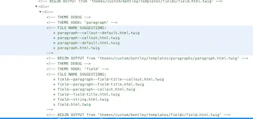
These are our paragraph template override names. In our case, let’s use paragraph--callout.html.twig. I like to copy the existing paragraph template (templates/paragraphs/paragraph.html.twig) as a starting point. Once you’ve copied that file and renamed as paragraph--callout.html.twig, let’s replace the default markup part with this:
{% include "@molecules/callout/callout.twig" with {
  callout_title: content.field_title,
  callout_subtitle: content.field_subtitle,
  callout_button_text: content.field_button.0['#title'],
  callout_button_url: content.field_button.0['#url'],
} %}
Assuming your field machine names are the same as the ones in bold above, once you’ve cleared the Drupal cache you should see your styled component with Drupal’s content!
For background, let’s break down the code a bit here as well. For starters, we’re using Twig’s include statement, which allows you to import the markup from any Twig file while replacing variables defined in that file. This kind of importing is what powers component-driven development in Drupal 8, because you can define a component once and reuse it in multiple places. Inside the with keyword, we’re passing our Drupal-specific content variables into the Twig variables defined in our imported component. The hardest part is figuring out the best way to get the value from your field. The devel/kint module can help you figure out the best way to get it (sometimes it’s as simple as content.field_title.value). But let’s not stop here; let’s allow content editors to add a differently styled Callout.
Component variations
Here’s the design for our variation (dark background, light text):

First, let’s add a variation in Storybook.
Storybook variation
Let’s add a new file named callout-dark.yml in your component directory. Inside, simply put the following:
callout_modifiers:
  - 'dark'
Now let’s adding the following to our Storybook file:
import React from 'react';
import callout from './callout.twig';
import calloutData from './callout.yml';
import calloutDarkData from './callout-dark.yml';

export default { title: 'Molecules/Callout' };

export const calloutDefault = () => (
  <div dangerouslySetInnerHTML={{ __html: callout(calloutData) }} />
);
export const calloutDark = () => (
  <div dangerouslySetInnerHTML={{ __html: callout({ ...calloutData, ...calloutDarkData }) }} />
);
Notice the usage of spreading properties here. This allows us to add a new component and combine more than one set of data (speeding up creating variants). For example, even though our new data file only contains a “dark” modifier, you will now see the new “Callout Dark” component in Storybook with all of the same data from the original with our new modifier class: (<div class="callout callout--dark">). You can use this methodology to speed up creating variants, but you always have the power to create completely different data per component. Now we’re ready to add the ability to select this variation in Drupal.
Drupal variation
Let’s add a new field to our Callout paragraph named “Variation” that is of the type “List (text).” In the Allowed Values list, simply add dark|Dark. Then, in paragraph--callout.html.twig, add the following above your include statement:
{%
  set callout_modifiers = [
    content.field_variation.0['#markup'] == 'dark' ? 'dark' : '',
  ]
%}
Here, we’re adding a variable into the callout_modifiers array that is a ternary statement that essentially says, “If our variation dropdown has ‘dark’ selected, add ‘dark’ into the modifiers.” Now, when an admin selects “Dark” from the Variation dropdown, it will add dark to the callout_modifiers variable, which shows the dark variation of your component in Drupal.
Recap
Now we have walked through how to set up a common component with a single variation in both Storybook and Drupal. In the next article in this series, we will cover some common complexity in component-driven development.
Read more of the Building with Emulsify series:
- Building with Emulsify part 1: Storybook
- Building with Emulsify part 2: Callout component
- Building with Emulsify part 3: Component complexity
- Building with Emulsify part 4: Component grid
Making the web a better place to teach, learn, and advocate starts here...
When you subscribe to our newsletter!