
Owner, Co‑Founder, and Chair
Todd is responsible for Four Kitchens’ long-term success.
April 17, 2023
Four Kitchens has made a lot of exciting changes in the past couple of years. We merged with Advomatic, doubling our client portfolio and underscoring our commitment to advocacy and mission-driven work. We added Manatí, growing our team by 50% and expanding into Costa Rica. We also added new services like technical strategy and content strategy — and new products like Continuous Care
We’re more capable and diverse, and larger than ever, yet our brand has remained the same. It no longer reflects who we are or who we want to be
It’s time to create a new Four Kitchens. One that better reflects our skills and expertise. One that speaks to the clients we love — and the clients we would love to work with. One that all Web Chefs can make their own, regardless of whether they’ve been here 17 years or started last month
Today, we are thrilled to introduce the new Four Kitchens brand
What follows is just a glimpse of our year-long collaboration with brand agency Focus Lab. They were instrumental in challenging long-held assumptions about how we tell our story. I could not be happier with the results
Let’s dig in!
New messaging reflects who we’ve become
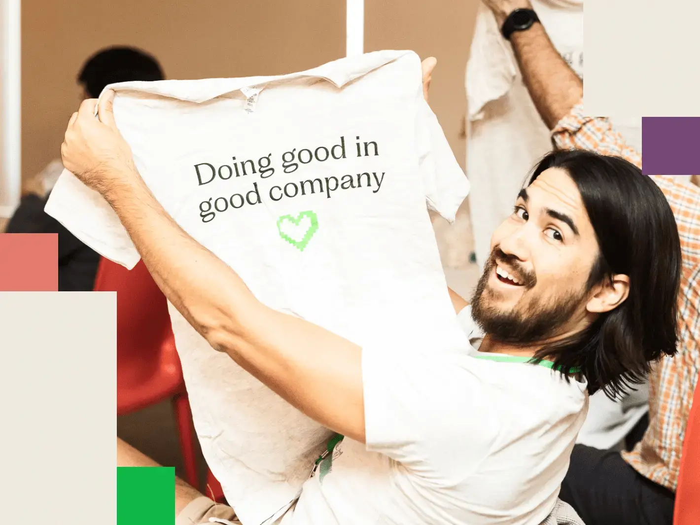
Our new brand is built on a single core idea: Doing good in good company.
As a brand strategy, it works on multiple levels. Fundamentally, we want our work to contribute to the greater good, which is why we focus on schools, nonprofits, and associations. But we also want our work to be good in terms of quality and effectiveness
By extension, we also want to surround ourselves with organizations and people who are also doing good. We want Four Kitchens to remain in good company.
We want our work to contribute to the greater good, which is why we focus on schools, nonprofits, and associations
Our new brand strategy — doing good in good company — is the foundation on which all other aspects of our messaging are built. Here are a couple of examples.
Clear purpose, mission, and vision
Our purpose, mission, and vision communicate our brand from an ideological perspective: Why do we exist as a company? How do we go about our work? What impact will our work have on the world?
We exist to make the web a better place to teach, learn, and advocate for all. To do this, we build content-driven websites that help organizations fulfill their missions. By doing this, we help create a world where knowledge is set free and the greater good is made better.
Differentiators
These identify the qualities that, when combined, set us apart from our competition.
- Content expertise: Our extensive experience working with some of the world’s largest publishers and media companies provides us unique insight into the challenges and opportunities of content creation, management, and distribution.
- Technical excellence. Unlike many agencies that treat engineering as an afterthought, technical strategy, architecture, and quality are foundational to our work.
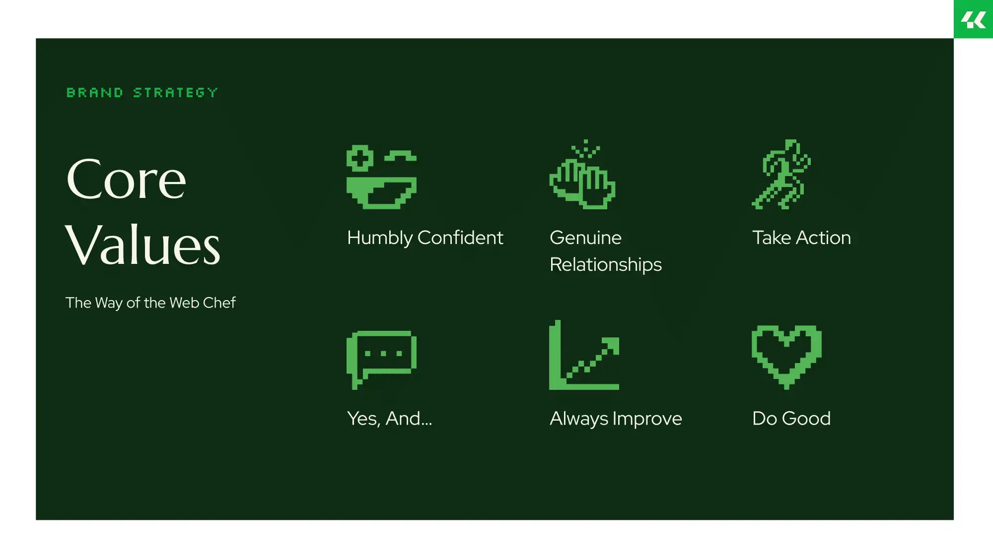
- The Way of the Web Chef (our Core Values). We live our values, and our values align with our clients’.
Now we can clearly state what makes us unique and why we are the best partner for our clients:
Informed by its content expertise and technical excellence, and driven to seek partnerships rooted in shared values, Four Kitchens crafts websites that help organizations fulfill their missions.
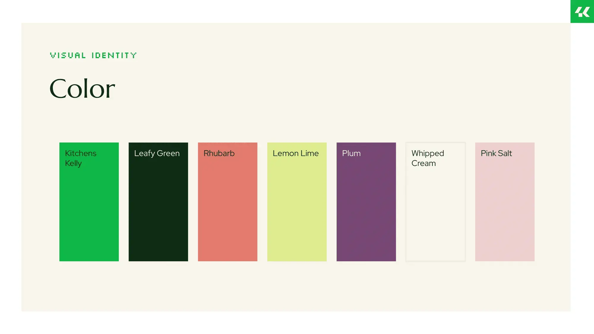
New visual identity is professional yet playful
Apart from our signature “Kitchens Kelly” green, we’ve revamped everything about our visual identity: our logo, color palette, typography, illustration, and photography.
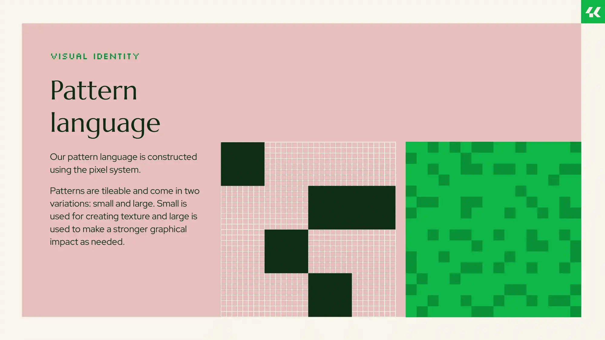
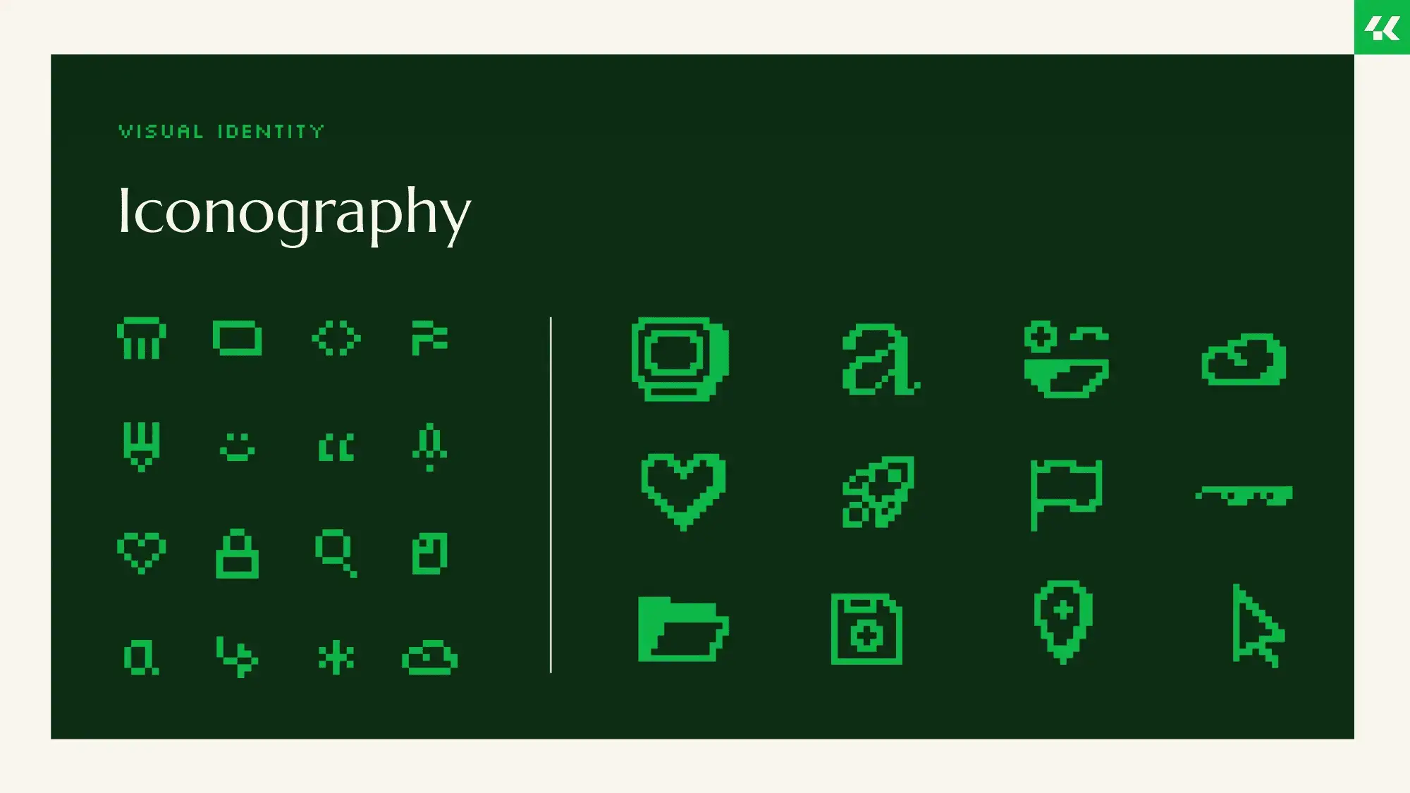
The pixel is at the heart of our visual identity
Like our old logo, our new logo subtly contains our abbreviated name. Four four-sided geometric shapes and some cleverly positioned whitespace combine to create “4K.” The square at the base of both the “4” and “K” evokes a pixel, which is echoed in the offset “I” of our logotype
![]()
![]()
In fact, the pixel is at the heart of our visual identity: We want to underscore that we’re a digital agency, not an architecture studio for restaurants. (We’ve received more than one inquiry for cabinets and countertops.) We also adopted a more vibrant palette of complementary colors along with typefaces and iconography that nod to our digital roots
![]()
![]()
What hasn’t changed
Our name
From the start of our rebrand, we never considered changing the name. That’s because “four kitchens” are at the heart of our origin story
I co-founded Four Kitchens in 2006 with three friends. We all met while working on the student humor publication at the University of Texas at Austin. After graduating, we launched That Other Paper, an alt-weekly whose website, built with Drupal, attracted the attention of several publishers who wanted help building their own websites. Soon, website development had our full attention
But we needed a place to live and work. A connection we made at a local open-source meetup led us to a potential workspace that was… Interesting, to say the least. An eccentric, custom-built structure nestled in the sprawling forests outside Austin, the workspace boasted four separate living areas, each with — you guessed it — its own kitchen
While we never moved into that workspace, the meaning behind those four kitchens remains the same: collaboration, creativity, and doing meaningful work.
“Kitchens Kelly” green
Since 2009, Kelly green has been our identifying color for our booths, track jackets, and swag at events. If our color were to change, it would feel like we’re becoming something unfamiliar. However, we needed to expand our palette to reflect our vibrancy and approach to making work fun
Our Core Values
Ultimately, who we are comes down to our Core Values: The Way of the Web Chef. We’ve navigated so many changes in the past few years, and this rebranding has comprehensively shifted how we express who we are. But our Core Values remain the same
Welcome to the new Four Kitchens
For us, well-designed websites are simply table stakes. That’s because we’re compelled by something greater than the work itself: our values. And we truly mean that. Our values influence how we hire. How we work. The clients we work with and the projects we take on. They guide us through the challenges we face and the successes we find on the other side
This approach has worked well for us and our partners. Over the years, we’ve assembled a formidable team of strategists, designers, and developers — true experts who are just as passionate about pushing the limits of the web as they are about creating positive change. Driven to understand our clients and the problems they need to solve, we’ve cultivated relationships with organizations we’re proud to call our partners and crafted web experiences that help them work better, connect with their audiences, and fulfill their missions
It’s one thing to build great websites. But it’s another thing to craft them with care to solve the problems you face — so you can help solve the bigger problems facing the world
Better websites. For a better world.

Making the web a better place to teach, learn, and advocate starts here...
When you subscribe to our newsletter!